


The Most Hated Bull Market in History
We are living through what many consider the most hated bull market in history. While cautionary graphs serve a purpose, context is crucial.
We're in an era where money supply expansion has reached unprecedented levels. The figures—135%, 403%, 206%—invite us to question: what does a potential 800% mean in this context?

Graph 1: Tech Manias
This graph is not taking into account the unprecedented levels of money supply expansion.I propose a different metric: dividing the Nasdaq by the benchmark of the amount of money printing in the market (M2).

Graph 2: Nasdaq Index Adjusted for Money Printing (M2)
This graph depicts the Nasdaq index adjusted for the amount of money printing in the market (M2), providing a different perspective on market valuations.
A bull market traditionally unfolds in three phases. The first is the discovery phase, where significant investment opportunities form, though price movements are modest. Next is the growth phase, where investments carry great potential without the high risk of a crash. Finally, we have the mania phase, characterized by rapid growth but also the risk of a 50% crash. From my perspective, we are on the brink of entering the mania phase. This happened in the dot-com bull market in November 1998 when the index surged from 1270 to 4372 by April 2000 (almost 4X!)

Graph 3: Dot-Com Bull Market Index Surge (1998-2000)
This graph illustrates the dramatic surge in the Nasdaq index during the dot-com bull market from 1270 in November 1998 to 4372 by April 2000.
This regime change does not prevent corrections; the frequency of drawdowns increases as we transition through phases. Phase changes within a bubble are often tied to crises that fly under the radar. In 1998, while everyone focused on high valuations in tech companies, the real problem lay in emerging markets. Few foresaw the Russian crisis and Latin American currency crises. These crises made tech assets the only viable investment, fueling the Nasdaq to new heights. What potential crisis might we face next?

Graph 4: Emerging Market Crises (USDBRL, USDCOP, USDKRW Impact on Nasdaq
This graph shows the impact of the Korean Currency Crisis, Russian crisis and Latin American currency crises in emerging markets and how these events drove investments into tech assets, pushing the Nasdaq to new heights. There is a very similar pattern nowadays.
The high probability of a Donald Trump presidency reinforces the thesis that we are in a second cold war, this time between the United States and China. Transaction costs are going to increase, and disruptions in supply chains are highly probable.
For me, the most important things to monitor are the costs of containers and production price idex, which are leading indicators of new potential inflationary shocks.
Graph 5: Container Transportation Cost
This graph highlights the importance of monitoring container as leading indicators of potential inflationary shocks.
AI energy demand and disruptions in supply chains could be massive drivers of high electricity prices—in other words, a tremendous opportunity for gas and uranium.
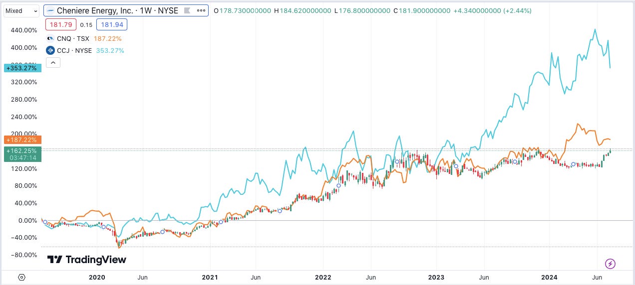
Graph 6 Investment Opportunities in Energy: CCJ (Uranium), CNQ, and LNG (Gas)
People argue that the big seven are the most crowded trades. However, they are not all the same. TSLA, as a transportation-as-a-service company, is lagging. On the other hand, companies in the semiconductor complex, such as TSM and ASML, are still highly attractive, and their price movements are not as extended as those of Super Micro Computer or NVIDIA.

Graph 7: Comparison of Big Seven Trades
This graph compares the performance and attractiveness of the big seven trades, highlighting the differences between companies like TSLA, and NVIDIA.
Disclaimer: This document is for informational purposes only and does not constitute investment advice. Please consult a financial advisor before making any investment decisions.
Thanks for reading,
Guillermo Valencia A
Cofounder of Macrowise
July 19th, 2024