
The VIX at 40: A Signal of Panic, But What’s the Real Story?
A VIX of 40 is a time to be greedy in tech, where the panic is creating opportunity, and fearful in high-yield bonds and EM currencies, where the calm feels like the eye of the storm.
Imagine you’re standing in the middle of a crowded room, and someone yells “Fire!” Everyone starts running for the exits, pushing and shoving, their faces painted with fear. That’s what a VIX reading of 40 feels like in the markets—a moment of sheer panic, a signal that investors are scrambling for safety. The VIX, often called the “fear index,” measures the market’s expectation of volatility over the next 30 days, derived from S&P 500 options prices. At 40, it’s screaming that something is wrong. But here’s the thing about panic: it’s not just the intensity of the fear that matters—it’s how long it lasts. And that’s where this chart comes in.

The scatter plot we’re looking at maps every VIX peak between 35 and 42 against the number of days it took for the VIX to revert to its mean—essentially, how long it took for the market to calm down. The data points are color-coded by the number of days to revert, with darker purples showing quicker recoveries (under 100 days) and brighter yellows indicating longer ones (up to 400 days). A VIX of 40 isn’t rare—it’s happened plenty of times. In 2024, on August 5th, the VIX hit 40, and the market exhaled in less than 10 days. Go back to 2018, and a similar spike reverted in about a month. But then there’s 1998, during the Long-Term Capital Management crisis, when the VIX spiked to 40 and took over 100 days to settle—a slow, grinding recovery that left scars.
What does this tell us? A VIX of 40 today—April 7, 2025—means we’re in a moment of panic, likely fueled by the noise around Donald Trump’s tariff policies. But the real question isn’t just “Are we panicking?” It’s “How long will this panic last?” Because if history is any guide, the speed of the VIX’s reversion to its mean can tell us whether this is a healthy shakeout or a deeper, structural problem. A quick reversion—say, 10 to 30 days, like we saw in 2024—often means the market is just letting off steam. The Nasdaq and S&P 500 tend to find their footing and push to new highs. A slow reversion, like in 1998 or more radically 2008, signals something uglier—a prolonged period of uncertainty that can drag down risk assets for months.
Separating Signal from Noise: What’s Really Driving This?
Markets are noisy. Always have been. But beneath the cacophony of headlines about tariffs and trade wars, there are signals that can help us see what’s really going on. Let’s start with the carry trade unwind, a dynamic that’s often a canary in the coal mine for global markets. The Australian dollar against the Japanese yen (AUD/JPY) is a classic proxy for this trade—investors borrow in low-yielding yen to buy higher-yielding Aussie dollars, often funneling the proceeds into riskier assets like tech stocks. When that trade unwinds, as it’s doing now (see the AUD/JPY chart), it’s a sign of deleveraging. Investors are pulling back, and that tends to spike the VIX. But does this mean the Nasdaq bubble is bursting? Not necessarily. The carry trade unwind is a signal of stress, not a death knell. It’s a reminder that leverage can amplify both gains and losses, and right now, the market is feeling the latter.
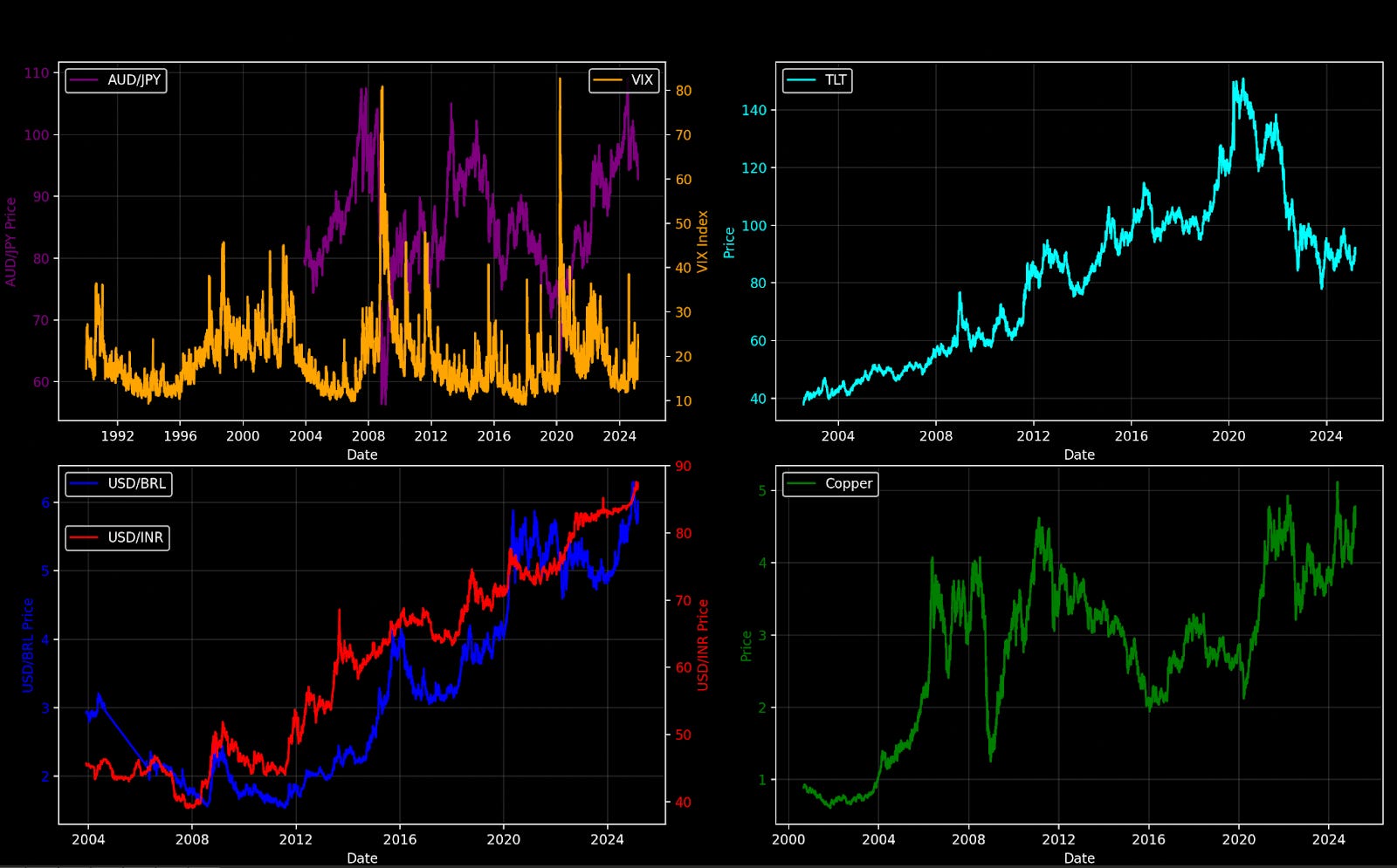
Next, let’s look at Treasuries. The iShares 20+ Year Treasury Bond ETF (TLT) chart shows a relentless decline since its peak in 2020-2021. Yields are rising, which means bond prices are falling—a structural shift driven by inflation fears, Fed policy, and a market that’s recalibrating after years of ultra-low rates. This isn’t a short-term blip; it’s a multi-year trend. Rising yields put pressure on growth stocks, especially in tech, because they increase the cost of capital and make future cash flows less attractive. But here’s the counterpoint: copper prices, a barometer of global economic health, aren’t signaling a recession. The copper chart shows a steady uptrend, with no major collapse in sight. If the global economy were truly on the brink, copper would be telling us. It’s not.
Now, let’s zoom in on currencies, where I think the real risk is hiding. The charts of the Brazilian real (USD/BRL) and Indian rupee (USD/INR) against the dollar show significant devaluations over the past decade, with sharp spikes during periods of global stress. When the carry trade unwinds, emerging market currencies often take the brunt of the pain—investors flee to the safety of the dollar, and countries like Brazil and India feel the squeeze. This isn’t making headlines, but it should. Devaluations can spiral into broader economic instability, especially in countries with high debt loads or political uncertainty. Warren Buffett once said, “Be fearful when others are greedy, and greedy when others are fearful.” Right now, the lack of attention on these currency moves makes me fearful—not of a crash, but of a slow-burn crisis that catches the market off guard.
The High-Yield Paradox: Where There’s No Volatility, There’s Danger

Here’s where things get really interesting. Amid all this chaos—the VIX at 40, the carry trade unwinding, currencies under pressure—there’s one corner of the market that’s eerily calm: high-yield bonds. The chart of the iShares High Yield Corporate Bond ETF (HYG) against its volatility measure shows HYG hitting all-time highs while volatility is at historic lows. In a market where everything else is screaming, high-yield bonds are whispering, “Everything’s fine.” But that’s exactly what makes me nervous. Low volatility in an asset class often signals complacency, and complacency is the precursor to a blowup. If this moment feels like 1998, as the VIX chart suggests, then high-yield bonds could be the next shoe to drop. Back then, the LTCM crisis exposed hidden leverage in the system, and the fallout accelerated the dot-com bubble. Today, with high-yield bonds showing no fear, I can’t help but think: Be fearful where there is no volatility.
The Tech Bubble and a New Lens: Nasdaq Divided by M2
Let’s tie this all together with a new perspective. The final chart I’d propose is the Nasdaq divided by the M2 money supply—a way to strip out the distortion of monetary expansion and see what’s really happening with tech valuations. Since the 2008 financial crisis, central banks have flooded the system with liquidity, pushing asset prices higher. But when you adjust for M2, you often see a different story. If we plot this, I suspect we’d find that the Nasdaq’s recent run isn’t just a product of easy money—it’s accelerating in real terms, much like it did in the late 1990s. A VIX of 40, in this context, isn’t a sign of a bursting bubble; it’s a sign of a bubble entering its most euphoric phase. This is when the madness begins, when fear gives way to greed, and when the biggest opportunities—and risks—emerge.

What to Do with a VIX at 40
So where does this leave us? A VIX of 40 is a moment to pay attention, not to panic. If it reverts quickly, history suggests the Nasdaq and S&P 500 will find new highs. If it lingers, we could be in for a rougher ride. The signals I’m watching—carry trade unwinds, currency devaluations, copper prices, and high-yield bond volatility—point to a market under stress but not on the brink of collapse. The real risk, I think, is in emerging market currencies and high-yield bonds, where the lack of attention and volatility is a warning sign. Meanwhile, tech looks poised for another leg up, potentially fueled by the same dynamics that drove the dot-com bubble to its peak.
A VIX of 40 is a time to be greedy in tech, where the panic is creating opportunity, and fearful in high-yield bonds and EM currencies, where the calm feels like the eye of the storm. But above all, it’s a time to look past the noise—tariffs, headlines, fear—and focus on the signals that matter. Because in markets, as in life, the difference between a crisis and an opportunity often comes down to how long the panic lasts, and what you do while everyone else is running for the exits.
Thanks for reading,
Guillermo Valencia A
Cofounder of MacroWise
April 7th, 2025